Introduction
Imagine trying to read thousands of rows of spreadsheet data without any visual aid. It’s overwhelming, time-consuming, and prone to misinterpretation. In a world where organizations rely on fast, data-driven decisions, clear visuals can be the difference between success and missed opportunities.
This is where Data Visualization in Power BI becomes critical. Whether you are a business analyst, data professional, or a beginner pursuing Power BI training, understanding the power of visuals will enhance your skills and career prospects.
In this guide, you’ll learn:
- Why data visualization matters in Power BI
- How visuals improve decision-making
- Real-world examples and use cases
- Step-by-step techniques to create impactful dashboards
- Best practices for clear and actionable reports
Let’s get started by exploring why data visualization is so essential.
What Is Data Visualization in Power BI?
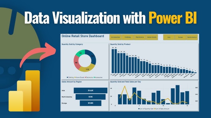
Data visualization is the process of turning raw numbers into graphical representations like charts, graphs, and maps. In Power BI, you can transform imported data into visuals that communicate patterns, trends, and outliers clearly.
For example:
- Column charts show sales over time.
- Pie charts reveal market share by product.
- Maps display regional performance.
- KPIs track progress against goals.
Unlike static Excel charts, Power BI visuals are interactive. Users can click, filter, and drill down into details without needing to write code. This interactivity is why Power BI has become a leading tool for modern business intelligence.
The Power of Visuals: Why Data Visualization Matters
Here are five compelling reasons why data visualization matters in Power BI:
It Reduces Complexity
Raw data in tables is difficult to understand. According to the MIT Sloan Management Review, 65% of people are visual learners. When you convert numbers into visuals, you make information accessible to everyone, regardless of their technical background.
For example:
A marketing team can instantly spot which campaigns delivered the highest ROI using a clustered bar chart, rather than parsing columns of numbers.
Power BI makes this transformation simple with drag-and-drop visuals.
It Accelerates Decision-Making
In today’s fast-paced business world, speed matters. A study by Aberdeen Group found that organizations using visual data discovery tools are 28% more likely to find timely information.
With Power BI, decision-makers can:
- View live dashboards updated in real time
- Drill into reports for root-cause analysis
- Spot trends early and adjust strategies faster
This agility is impossible with spreadsheets alone.
It Drives Engagement
Data storytelling is a proven way to capture attention. Visuals encourage users to explore and interact with data instead of passively consuming reports.
In Power BI, you can:
- Create tooltips that explain visuals when users hover over them
- Use bookmarks for guided navigation
- Integrate images and icons to enhance understanding
For example:
A sales dashboard with dynamic visuals and clear color coding will engage your sales team more effectively than static tables.
It Enhances Accuracy
Manual reporting is prone to errors. Visual tools in Power BI link directly to data sources, ensuring reports stay current and accurate.
Additionally, visuals can highlight inconsistencies immediately. For example:
- An unexpected spike in a line chart could indicate a data entry error
- A missing value in a scatter plot becomes obvious right away
This transparency builds trust in your data.
It Supports Collaboration
Power BI dashboards are cloud-based. Team members across departments can access shared reports anytime.
Features like:
- Row-level security (show only relevant data)
- Comments (discuss insights within reports)
- Subscriptions (receive updated reports automatically)
…help organizations collaborate around visual insights seamlessly.
Real-World Example: How Power BI Visualization Transformed a Retail Business
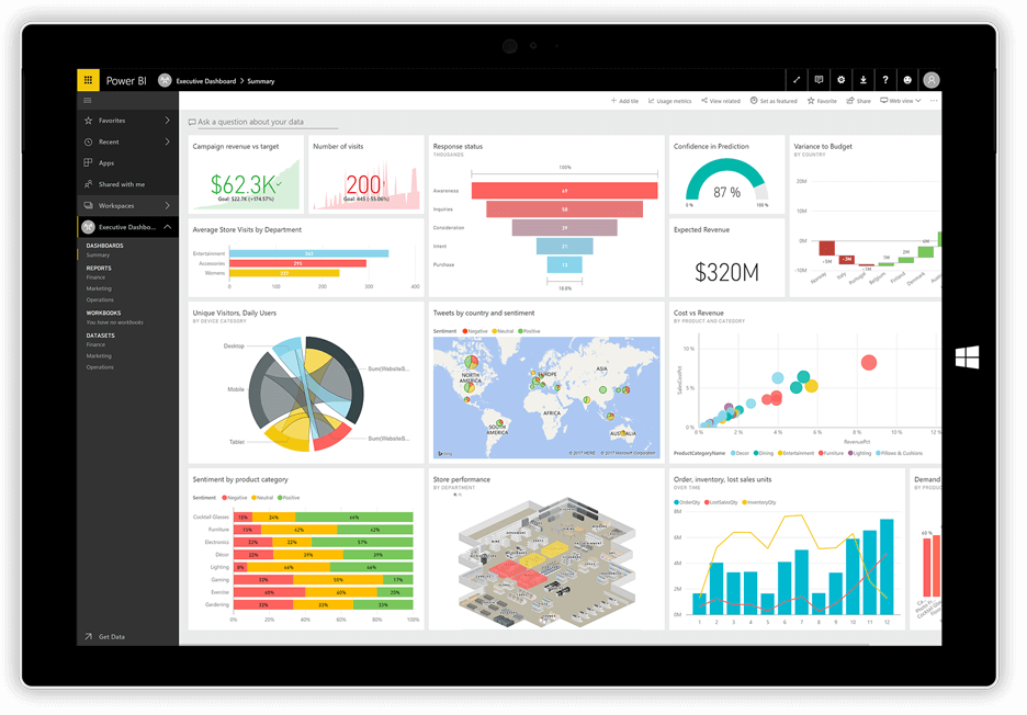
Let’s look at a practical example:
A mid-sized retail chain was struggling to track sales performance across 50 stores. Reports were generated manually in Excel, leading to delays and confusion.
After implementing Power BI:
- They built an interactive sales dashboard with column charts, KPIs, and maps.
- Managers could filter results by store, product, and time period.
- Regional teams identified underperforming locations within seconds.
- The CEO received a weekly email subscription to track progress.
Results:
- Reporting time dropped by 75%.
- Revenue increased by 12% because issues were spotted early.
- Team engagement improved dramatically.
This example demonstrates why data visualization in Power BI is not just a “nice-to-have” it’s a strategic advantage.
How to Create Impactful Visualizations in Power BI: A Step-by-Step Guide
If you’re enrolled in a Power BI course or exploring Power BI training, follow this hands-on process to create a meaningful report.
Step 1: Connect Your Data
Power BI supports connections to Excel, SQL Server, Azure, Salesforce, and many other sources.
Example:
plaintext
Home > Get Data > Excel > Select your file > Load
Step 2: Clean and Transform Data
Use Power Query Editor to:
- Remove duplicates
- Split columns
- Format data types
Tip:
Always name columns clearly. Descriptive names improve understanding in visuals.
Step 3: Choose the Right Visuals
Select visuals based on the story you want to tell:
- Bar/Column Charts: Compare quantities
- Line Charts: Show trends over time
- Pie Charts: Display parts of a whole
- Maps: Visualize geographic data
- Cards/KPIs: Highlight key metrics
Example:
Use a Stacked Column Chart to show monthly sales by region.
Step 4: Design for Clarity
Apply design principles to make visuals intuitive:
- Use clear titles and labels
- Limit colors to avoid confusion
- Highlight important data with contrasting colors
- Avoid 3D charts that distort perception
Example:
Instead of red and green (which can be hard for color-blind users), use blue and orange for contrast.
Step 5: Enable Interactivity
Make reports dynamic by:
- Adding slicers for filtering
- Creating drillthrough pages for details
- Using tooltips for explanations
Example:
Allow users to click on a product category to see detailed sales breakdowns.
Step 6: Share and Collaborate
Publish your report to the Power BI Service:
plaintext
Home > Publish > Select Workspace
Then:
- Share with stakeholders
- Set up subscriptions
- Configure row-level security
Best Practices for Effective Data Visualization in Power BI
Follow these guidelines to make your reports impactful:
Focus on the Message
Every visual should answer a specific question. Avoid adding visuals that don’t support your story.
Prioritize Simplicity
Less is more. Too many visuals on one page can overwhelm users.
Use Consistent Formatting
Keep fonts, colors, and labels consistent throughout your report.
Test with Users
Ask a colleague to review your report. If they can understand it quickly, you’re on the right track.
Leverage Built-in Themes
Power BI has themes to create visually appealing, cohesive designs.
The Role of Data Visualization in Career Development
Learning data visualization in Power BI is more than a technical skill. It’s a career accelerator.
According to LinkedIn’s Emerging Jobs Report, data visualization is one of the top 10 skills employers want. Professionals who can translate data into actionable insights are highly valued across industries.
By mastering Power BI visualization, you will:
- Build compelling reports that influence decisions
- Stand out in interviews and promotions
- Deliver more value to your organization
Industry Statistics That Prove the Value of Data Visualization
- Data-driven companies are 23 times more likely to acquire customers (McKinsey & Company).
- Users following directions with visuals do 323% better than those without visuals (W. Howard Levie, Richard Lentz).
- Power BI adoption has grown 49% YoY among Fortune 500 companies (Microsoft Annual Report).
These statistics underscore why learning to visualize data effectively is no longer optional — it’s essential.
Common Mistakes to Avoid in Power BI Visualization
Here are pitfalls to watch out for:
Overloading Reports: Too many visuals dilute your message.
Ignoring Audience Needs: Tailor visuals to your users’ knowledge level.
Using the Wrong Chart Type: Match chart types to the data story.
Inconsistent Colors: Colors should have clear, consistent meaning.
Neglecting Mobile Optimization: Many stakeholders view reports on tablets or phones.
Avoiding these mistakes will ensure your reports drive clarity and action.
Key Takeaways
Data visualization in Power BI simplifies complex information.
It accelerates decisions and improves accuracy.
Interactive visuals engage teams and foster collaboration.
Mastering visualization skills boosts your career prospects.
Real-world applications drive measurable business outcomes.
Conclusion
Data visualization in Power BI turns raw data into actionable insights that empower better decisions. Whether you’re exploring your first report or designing enterprise-level dashboards, strong visualization skills will set you apart.
Ready to transform your skills into career success?
Enroll in our Power BI course at H2K Infosys today and master data visualization hands-on!


