Introduction
Imagine having a massive spreadsheet full of numbers, sales, profit, customer data, and regions all waiting to reveal a story. Reading those numbers alone doesn’t show much. But visualise them in Tableau, and suddenly patterns, trends, and insights jump out clearly. That’s the power of the right visualisation.
If you’re pursuing a Data Analytics certification or taking a Data Analytics course, learning the Top Tableau Visualizations is essential. They help you transform raw data into actionable insights that support smarter, faster business decisions.
In this guide, we’ll explore the top Tableau visualizations that every aspiring data analyst should master. You’ll learn what they are, when to use them, and how they apply to real-world data analytics problems.
Why Visualizations Are Critical in Data Analytics
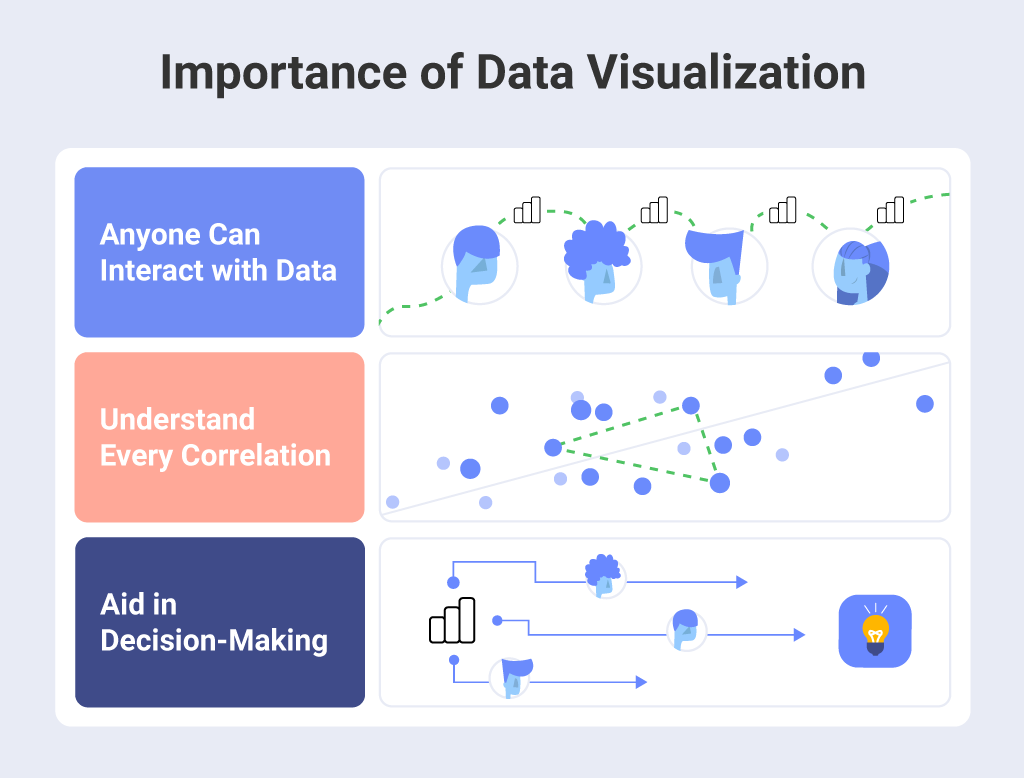
In data analytics, numbers only tell part of the story. Tableau Visualizations completes it. It transforms rows of data into a form that’s easy for the human brain to process and understand.
Here’s why visualizations are vital:
- Quick insights: Humans process visuals 60,000 times faster than text. Visual charts highlight key insights instantly.
- Better storytelling: Decision-makers relate better to visuals than to spreadsheets or technical jargon.
- Pattern discovery: Trends, correlations, and anomalies are easier to identify visually.
- Data-driven decisions: Effective visualizations drive business strategies with clarity.
- Career advantage: Employers value analysts who can present data in visually compelling, business-friendly ways.

When you combine the right visualization with clean, accurate data, you not only communicate insights effectively but also make those insights memorable and actionable.
Framework for Choosing the Right Visualization
Before jumping into specific chart types, it’s important to know how to pick the right Tableau Visualizations. Here’s a simple three-step framework used by professional analysts and taught in most Data Analytics courses:
- Define your goal:
Ask what question you want to answer. Are you tracking trends, comparing categories, showing proportions, or exploring relationships? - Understand your data:
Identify whether your data is categorical (like region or product type), numerical (like sales or profit), or time-based. - Match visualization to purpose:
Use trend charts for time-series data, bar charts for comparisons, maps for geographic data, and scatter plots for relationships.
Keeping this framework in mind ensures that every visualization serves a clear analytical purpose.
Top Tableau Visualizations for Effective Data Analytics
Let’s explore the Top Tableau Visualizations that power effective data analytics. Each visualization type below includes when to use it, why it works, and practical examples.
Line Chart – Visualizing Trends Over Time
Purpose: To show how values change over time (e.g., sales by month or revenue by year).
Why it works:
Our eyes easily detect upward or downward slopes, making line charts ideal for trend analysis.
How to build it in Tableau:
- Drag your date field (like “Order Date”) to the Columns shelf.
- Drag your measure (like “Sales”) to the Rows shelf.
- Choose the Line chart option from “Show Me.”
Example:
A retail company tracks monthly sales for the past two years. A line chart instantly shows if sales are growing, stable, or dropping in specific months.
Pro Tip:
Add a dual-axis to compare two metrics, such as Sales vs Profit. This is a great exercise in your Data Analytics course.
Bar Chart – Comparing Categories
Purpose: To compare values across categories, such as regions, products, or customer segments.
Why it works:
Bar charts are simple yet powerful. They make it easy to rank or compare multiple categories side by side.
How to build it in Tableau:
- Drag your categorical field (e.g., “Product Category”) to Rows.
- Drag your measure (e.g., “Sales”) to Columns.
- Sort descending to show the highest performers first.
Example:
A company uses a bar chart to see which region generates the most revenue. Instantly, management knows where to focus marketing efforts.
Pro Tip:
Apply color coding to highlight top-performing categories. It adds clarity and visual appeal.
Treemap – Showing Part-to-Whole Relationships
Purpose: To display how parts contribute to a whole, often within hierarchical data (e.g., Category → Sub-Category).
Why it works:
Treemaps visually represent proportions using nested rectangles, helping you see both hierarchy and relative size at once.
How to build it in Tableau:
- Drag Category and Sub-Category to the view.
- Drag Sales or another measure to Size.
- Drag Profit or a related measure to Color.
Example:
An e-commerce company wants to see which product sub-categories drive total sales. The treemap reveals that furniture contributes less revenue compared to office supplies.
Pro Tip:
Use color to represent profitability. Red for losses and green for profits create quick visual cues.
Heat Map – Identifying Patterns and Intensities
Purpose: To show data intensity or concentration across two dimensions.
Why it works:
Color variation helps the viewer quickly identify hot spots or problem areas.
How to build it in Tableau:
- Drag two dimensions (e.g., Region and Month) to Rows and Columns.
- Drag a measure (e.g., Sales) to Color.
- Choose “Square” as the mark type for a true heat map.
Example:
A logistics company monitors delivery delays across cities and months. The heat map shows which months experience higher delays.
Pro Tip:
Use a diverging color palette (for example, blue to orange) to distinguish low and high values clearly.
Scatter Plot – Exploring Relationships Between Variables
Purpose: To show relationships or correlations between two numeric variables.
Why it works:
Scatter plots make it easy to see clusters, trends, or outliers in your data.
How to build it in Tableau:
- Drag one measure (e.g., Sales) to Columns.
- Drag another measure (e.g., Profit) to Rows.
- Drag a category field (e.g., Region) to Color.
Example:
A marketing team wants to analyze whether higher marketing spend leads to higher revenue. A scatter plot reveals a strong positive correlation.
Pro Tip:
Add a trend line in Tableau to visualize the correlation strength. This skill is often tested in a Data Analytics certification exam.
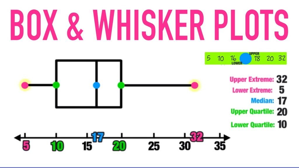
Box-and-Whisker Plot – Analyzing Distribution

Purpose: To understand how data values spread and detect outliers.
Why it works:
Box plots display the median, quartiles, and outliers, providing a compact summary of data distribution.
How to build it in Tableau:
- Drag your categorical variable (e.g., Region) to Columns.
- Drag your measure (e.g., Sales) to Rows.
- Select Box-and-Whisker Plot from the “Show Me” panel.
Example:
A financial analyst uses a box plot to compare customer spending patterns across different branches. Outliers show which branches have unusually high or low sales.
Pro Tip:
Use box plots during data preparation to detect anomalies before analysis.
Geographic Map – Visualizing Spatial Data
Purpose: To display data across geographic regions (countries, states, or cities).
Why it works:
Maps instantly reveal spatial trends and geographic performance differences.
How to build it in Tableau:
- Drag a geographic dimension (like “State”) to the view.
- Tableau automatically generates a map.
- Drag a measure (like “Sales”) to Color or Size.
Example:
A retail chain visualizes store revenue across states. The map highlights top-performing states, guiding regional investment decisions.
Pro Tip:
Use filled maps for regions and symbol maps for specific locations, such as store branches.
Bullet Graph – Comparing Performance Against Targets
Purpose: To evaluate performance against benchmarks or goals.
Why it works:
Bullet graphs show actual performance, target lines, and performance ranges in one compact view.
How to build it in Tableau:
- Create a calculated field for “Target.”
- Drag “Sales” to Columns and “Category” to Rows.
- Select “Bullet Graph” from “Show Me.”
- Add your target field as a reference line.
Example:
A company tracks monthly sales performance against targets. The bullet graph clearly shows which teams are meeting, exceeding, or missing goals.
Pro Tip:
Use bullet graphs in dashboards for executives. They summarize KPIs without taking too much space.
Combining Visualizations in Dashboards
Once you master individual charts, the next step is creating dashboards that combine multiple Tableau Visualizations. A good dashboard tells a complete story—what happened, why it happened, and what to do next.
Best Practices for Dashboards:
- Use consistent color themes for professional readability.
- Keep it simple. Include only the visuals necessary for key insights.
- Add filters and interactivity so users can explore their own insights.
- Guide the viewer’s eye. Arrange charts from overview to detail (e.g., KPI → Trend → Breakdown → Map).
Example layout:
- Top row: Bullet graphs showing KPIs.
- Middle row: Line chart for trend and bar chart for category ranking.
- Bottom row: Map for geographic data and heat map for performance by region.
In a Data Analytics course, you might build such a dashboard as your capstone project to demonstrate end-to-end analytics skills.
Real-World Example: Retail Sales Analysis
Consider a retail company analyzing annual performance:
- Line Chart: Shows monthly sales trends.
- Bar Chart: Compares revenue by product category.
- Treemap: Displays contribution of sub-categories to overall sales.
- Heat Map: Highlights sales peaks and dips by region and month.
- Map: Visualizes store performance across different states.
- Bullet Graph: Compares actual sales to targets.
The dashboard reveals that sales dipped in the South region during Q3, while the East performed above target. Based on this insight, management increased marketing in the South, improving next quarter’s revenue.
This case illustrates how mastering Top Tableau Visualizations can lead to real business improvements.
Hands-On Tutorial: Build a Tableau Dashboard
Follow these steps to build a mini dashboard using Tableau:
Step 1: Connect to Data
Load your dataset (for example, “SalesData.csv”) into Tableau.
Step 2: Prepare the Data
- Check data types for accuracy (e.g., Date fields).
- Create calculated fields if needed (like “Profit Margin = Profit / Sales”).
Step 3: Build Key Visualizations
- Line Chart: Sales over time.
- Bar Chart: Sales by Category.
- Map: Sales by Region.
Step 4: Combine in a Dashboard
- Create a new Dashboard.
- Drag your charts onto the canvas.
- Add interactive filters (for Region or Product).
- Add a title and explanatory text box.
Step 5: Analyze and Present
Use the dashboard to answer business questions such as:
- Which product category is most profitable?
- Which region shows declining performance?
- How do trends vary across months?
This hands-on experience mirrors real projects in professional analytics roles.
Applying Tableau Skills in Your Data Analytics Certification

Learning Tableau is not just about making charts—it’s about storytelling with data. Here’s how it ties into your Data Analytics certification:
- Practical application: You’ll practice real-world scenarios during training.
- Portfolio creation: Tableau dashboards showcase your analytical ability.
- Industry relevance: Tableau remains one of the top BI tools used globally.
- Job readiness: Employers seek professionals skilled in turning data into decisions.
Through your Data Analytics course at H2K Infosys, you’ll get guided training in Tableau along with hands-on projects to apply what you learn immediately.
Common Mistakes to Avoid
Even the best visuals can fail if misused. Avoid these common pitfalls:
- Too many visuals: Overloaded dashboards confuse users. Keep it simple.
- Inconsistent colors: Use standard palettes that align with data meaning (e.g., red for loss, green for gain).
- Poor labeling: Always include axis titles and legends.
- Wrong chart type: Choose a visualization that fits your question, not what looks flashy.
- Ignoring interactivity: Dashboards should let users explore data through filters or tooltips.
By following best practices, you ensure your Tableau visualizations communicate insights clearly and professionally.
Key Takeaways
- Top Tableau Visualizations are the foundation of effective data storytelling.
- Each chart type, line, bar, treemap, heat map, scatter plot, box plot, map, and bullet graph serves a specific analytical purpose.
- Visualization makes data more accessible, engaging, and actionable.
- Combining visualizations into dashboards provides a full picture of business performance.
- Hands-on practice during your Data Analytics course helps you master these visual tools for real-world success.
Conclusion
Visualising data is not just about design it’s about communication. The Top Tableau Visualizations help you turn data into stories that inspire decisions. Whether you’re exploring trends, comparing performance, or identifying outliers, Tableau empowers you to make complex data simple and actionable.
If you’re ready to build these skills, enrol in H2K Infosys’ Data Analytics course today. Get hands-on experience with Tableau, earn your Data Analytics certification, and start your journey toward a successful analytics career.


