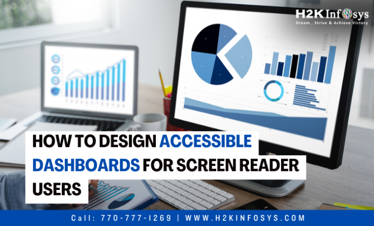
Accessible Dashboards are used to disseminate and monitor data in many different domains, such as public policy, healthcare, and business and finance. Accessible Dashboards are effective interfaces for data analysis and communication because of the interactivity and many visual elements (such as text, filters, and charts) that they contain. But the same features that make dashboards so effective also frequently render them inaccessible to persons with low vision (BLV), who use screen readers like VoiceOver and JAWS to engage with dashboards most of the time. Currently available dashboards allow screen reader users to navigate via individual elements or access the underlying dataset, but neither of these experiences compares to using a dashboard’s visual structure or dynamically querying data using the supported interactions. Check out the online Tableau course to learn more.
Design Process and User Experience
In summary, Tableau stated that in order to make dashboards accessible using screen readers, a (small) number of elements needed to be present:
- A written overview of the dashboard;
- An intuitive document object model (DOM) structure; and
- A summary of significant modifications following data updates (for example, by filtering).
With the above specified design objectives in mind, they put into practice Azimuth, a prototype system that creates Accessible Dashboards that are tailored for screen reader users. To be more precise, the system parses the dashboard specification given a dataset and creates a web page with a dashboard that is naturally structured for easy screen reader browsing. In addition to the dashboard, Azimuth produces a written summary that highlights the dashboard’s main conclusions.
Finally, the system dynamically populates and updates summaries of the data changes through a textual change description as users interact with the created dashboard and apply filters. SRUs can obtain an overview using the description and then utilise the dashboard canvas and dynamic change summaries for analysis thanks to the structured dashboard and complimentary descriptions.
Accessible Dashboards Description
Azimuth creates a description that encapsulates the main ideas and information on the Accessible Dashboards . First, the description gives viewers an overview of the dashboard’s contents in the form of a short, alt-text-style summary that includes metadata such as the dashboard title, the quantity and kind of components, and whether or not there are any interactive filtering options. The description then enumerates the dashboard’s primary data facts. These data facts comprise a summary of each dashboard chart’s major takeaway, which Azimuth automatically determined using a set of statistical functions, and a call-out of any KPIs present.

Finally, the description condenses the visual arrangement of the dashboard canvas into a grid of rows and columns to assist users in building a mental image of the dashboard. By connecting the text to the relevant component headers in the main dashboard, this layout summary also functions as an interactive dashboard index.
Dashboard Structure & Navigation
Azimuth optimises for screen reader-based readability and navigation while rendering the Accessible Dashboards . For example, even in cases where a component’s name isn’t stated clearly in the input specification, the system makes sure that it has a suitable title. In addition, the system inserts a filter widget (such as a dropdown menu or radio button) for the chart’s underlying dimension automatically when it recognizes interactive chart components in the input specification, making interactive filtering easier to understand and use. Within the Document Object Model (DOM), we utilise conventional HTML form controls such as <select> and adhere to a consistent heading structure (e.g., separate dashboard components are all at the same heading level). Users can freely traverse the dashboard and take advantage of built-in screen reader shortcuts to jump to specific sections as needed thanks to the constant use of common web components (e.g., pressing the ‘F’ key in JAWS to cycle among filters).

Change Description
The capacity to dynamically query data by applying various filters or to actively monitor real-time data is one of the primary features of dashboards, as was previously mentioned. In such cases, Azimuth also automatically provides a textual change explanation to aid screen reader users in understanding and following changes between states of the dashboard. Along with a list of any current data filters and a summary of the number of dashboard components affected by a data change, this change description also includes a set of important data takeaways that are comparable to those in the original dashboard description. Through the use of the change description, Azimuth facilitates two types of analytical inquiry: summary and comparison.
Similar to the takeaways in the Accessible Dashboards description, but for a portion of the data, the summary mode (by default) of the system displays the data facts for the dashboard’s current state. However, when the dashboard is in comparison mode, the change description is worded to both express the most important lessons learned from the active state and to compare them to the dashboard’s previous state.
Conclusion
To learn more about Tableau, check out the Tableau online training.