Introduction: Why Data Visualization Principles Are the Heart of Analytics
In a world overflowing with data, the challenge for businesses is no longer collecting information; it’s interpreting and acting on it. Every second, organizations generate data from customer transactions, website interactions, social media activity, supply chain operations, and countless other sources. But raw data in spreadsheets is meaningless without context.
This is where Data Visualization Principles play an essential role. These principles transform large, complex datasets into clear, visual narratives that decision-makers can understand at a glance. When applied correctly, they turn static information into compelling stories that drive change, innovation, and business growth.
For aspiring analysts, mastering these principles is just as important as learning statistical methods or programming. A Data Analytics certification from H2K Infosys doesn’t just teach you the “how” of analytics; it gives you the “why” behind effective visualization, ensuring your insights resonate with both technical and non-technical audiences.
The Role of Data Visualization Principles in Data Analytics
Data visualization is not simply “making charts.” It is a structured approach to presenting data in a way that is clear, accurate, and actionable. Applying Data Visualization Principles ensures that:
- Complexity becomes clarity – Large datasets are distilled into visuals that anyone can interpret.
- Patterns become visible – Trends, correlations, and anomalies stand out instantly.
- Decisions become faster – Executives don’t need to read through 50-page reports; they can understand performance in a single dashboard.
- Stories become persuasive – Data combined with the right visual context inspires confidence and action.
When you complete a Google Data Analytics certification, you’ll see that visualization is more than aesthetics; it’s the bridge between analysis and action.
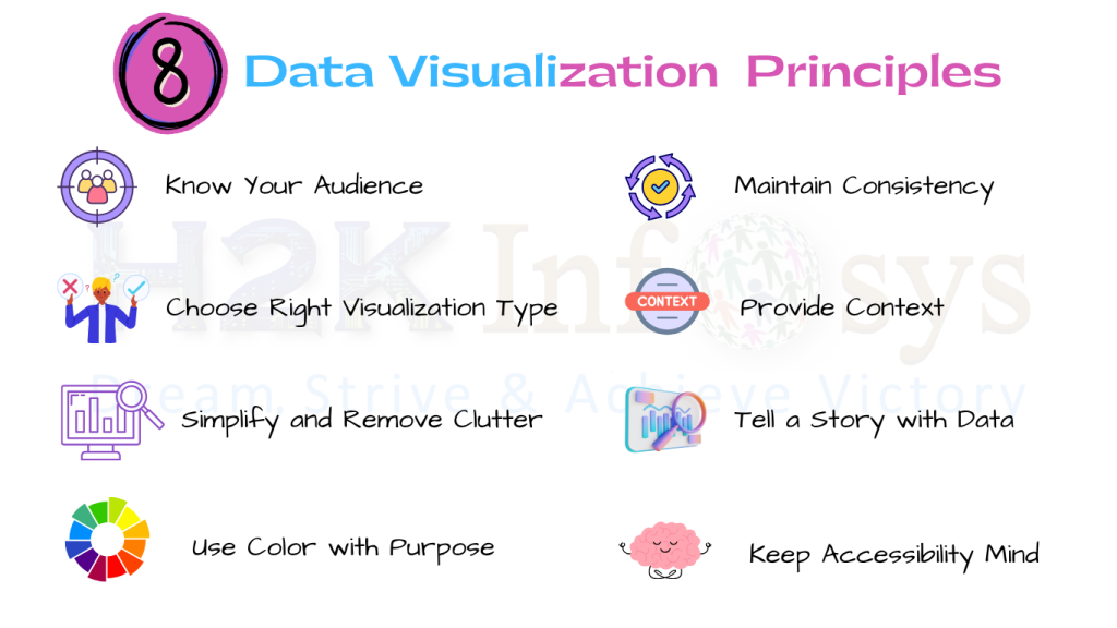
Principle 1: Know Your Audience
The foundation of Data Visualization Principles is understanding who will use your visualization and why. Your audience determines everything from the type of chart you choose to the complexity of your dashboard.
- Executives want concise, high-level summaries, think KPIs, year-over-year growth, and top trends.
- Marketing teams may require visuals broken down by customer segments and campaign performance.
- Data scientists need detailed, technical plots with statistical depth.
Example: A retail chain reporting to its CEO might show a single bar chart of regional sales. The same dataset presented to regional managers could include detailed breakdowns by store, product category, and period.
In H2K Infosys’s online Data Analytics certificate program, learners build dashboards for multiple audience types, gaining practical skills in tailoring visuals for maximum clarity and impact.
Principle 2: Choose the Right Visualization Type
One of the most important Data Visualization Principles is selecting the best chart or graph for the job. A poorly chosen visual can distort the message or confuse viewers.
Common chart uses:
- Bar charts: Compare discrete categories (e.g., sales by region).
- Line charts: Show changes over time (e.g., monthly revenue trends).
- Scatter plots: Identify relationships (e.g., ad spend vs. sales).
- Heat maps: Display density or intensity (e.g., website traffic by hour).
- Pie charts: Show proportions (best for limited categories).
Example: If you’re showing sales trends over five years, a line chart communicates upward or downward movement, whereas a pie chart would fail to show time-based progression.
Through a data analyst certification online at H2K Infosys, you’ll gain hands-on experience choosing visuals that fit the story the data tells.
Principle 3: Simplify and Remove Clutter
Clarity is one of the cornerstones of Data Visualization Principles. Too much detail, whether excessive gridlines, unnecessary colors, or decorative effects, can distract viewers from the main point.
Tips to simplify:
- Use no more than 3–5 colors for a single visual.
- Avoid decorative chart elements that don’t add meaning.
- Emphasize the most important values with highlights or bold text.
Example: Instead of displaying a bar chart with 15 product categories, group smaller categories into “Other” to keep the chart readable.
In data analytics training at H2K Infosys, students practice stripping away noise to make visuals cleaner, sharper, and more effective.
Principle 4: Use Color with Purpose
Color is a powerful communication tool in Data Visualization Principles, but only when used with intention.
Best practices:
- Use consistent colors for recurring categories (e.g., blue for 2024 data, green for 2025).
- Apply contrasting colors to highlight important data points.
- Use muted tones for background elements so primary data stands out.
Example: In a sales dashboard, you might use green to represent growth and red to represent decline. This instantly communicates performance without viewers having to read labels.
Color theory is covered in the best data analytics courses, ensuring your visuals communicate meaning, not just style.
Principle 5: Maintain Consistency
Inconsistent formatting is a silent killer of clarity. A core element of Data Visualization Principles is ensuring that scales, colors, and labels remain uniform across all charts and dashboards.
Consistency tips:
- Keep number formats (e.g., currency, decimals) identical.
- Align time ranges across visuals when comparing trends.
- Maintain uniform labeling conventions (e.g., always show percentages with the % sign).
In the Data analytics course near me offered by H2K Infosys, students create multi-page dashboards where maintaining consistency is key to professional presentation.

Principle 6: Provide Context
Even the most beautiful chart is useless without context. Data Visualization Principles emphasize adding supporting information so viewers can interpret the data accurately.
Ways to add context:
- Include descriptive titles.
- Label axes clearly with units.
- Provide benchmarks (e.g., industry averages, previous year’s results).
Example: A chart showing 10% growth looks impressive until you reveal that the industry average is 25%.
Through data analytics courses for beginners, H2K Infosys teaches students how to give viewers the “big picture” alongside the numbers.
Principle 7: Tell a Story with Data
At the heart of Data Visualization Principles lies storytelling. A good visualization doesn’t just show data, it takes the audience on a journey.
Storytelling structure:
- Introduce the problem or question.
- Present the data visually to support the narrative.
- Lead to a conclusion or recommendation.
Example: A customer churn dashboard might start with declining retention rates, break down the causes, and finish with suggested actions.
In H2K Infosys’s online course in data analytics, learners practice building visual narratives for real-world case studies.
Principle 8: Keep Accessibility in Mind
True professionals apply Data Visualization Principles that account for accessibility. Your visuals should be clear for all audiences, including those with visual impairments.
Accessibility tips:
- Use colorblind-friendly palettes.
- Ensure a strong contrast between text and background.
- Provide alt-text for charts in digital reports.
In the data analytics certification online from H2K Infosys, students learn to design with inclusivity in mind, expanding the reach of their insights.
Hands-On Example: Applying Data Visualization Principles in a Dashboard
Scenario:
You are building a quarterly sales dashboard for multiple regions.
Step-by-step process:
- Identify the audience: executive leadership.
- Select KPIs: revenue, profit margin, growth rate.
- Choose the right chart types (line chart for trends, bar chart for regional comparison).
- Apply purposeful colors to highlight top-performing regions.
- Add filters for interactivity (region, product, time frame).
- Provide comparisons to last year’s performance.
This project mirrors the assignments in the Google Data Analytics certification at H2K Infosys, reinforcing Data Visualization Principles through practice.
Common Mistakes to Avoid
Even seasoned professionals sometimes violate Data Visualization Principles.
Common errors:
- Overloading visuals with excessive data points.
- Choosing flashy but misleading chart types.
- Ignoring responsive design for mobile users.
In data analytics training, you’ll learn to identify and correct these errors before delivering your final report.
Why Choose H2K Infosys to Learn Data Visualization Principles
If you’re searching for the best data analytics courses, choose one that teaches technical analysis alongside Data Visualization Principles. H2K Infosys offers:
- Live, instructor-led classes.
- Practical, project-based assignments.
- Real-world case studies from multiple industries.
- Career guidance and placement assistance.
Whether you join a data analytics course near me or attend from anywhere online, you’ll develop skills that employers actively seek.
Key Takeaways
- Data Visualization Principles are essential for turning raw data into clear, actionable insights.
- Tailor every visual to your audience’s needs.
- Simplicity, clarity, and context are your strongest tools.
- Storytelling transforms data from numbers into narratives.
Conclusion
Mastering Data Visualization Principles is a career-defining skill for every aspiring analyst. With H2K Infosys’s data analytics courses for beginners and advanced learners, you’ll gain the ability to create visuals that don’t just inform, but inspire.
Enroll today in our Online course data analytics and start transforming your data into powerful business stories.
