


Stories are ubiquitous instruments of interaction. They pass through us, leading us on a path filled with danger, triumph, sorrow, and love Tableau. Although stories are as old as time itself, Tableau provides a strong and contemporary platform for sharing stories.
What precisely is a Tableau story, then? It is similar to a traditional story in many ways, however in this instance, the facts, exposition, charts, and key question can be viewed as a sequence of conflicts that build to a climax, with the call to action serving as the plot resolution. Naturally, the visual appeal also becomes your own writing style!
In essence, Creating Stories in Tableau uses a sequence of logically connected images to tell the tale of important insights to address a data challenge. Using a set of sheets from a Tableau worksheet called story points, we create Tableau stories. To learn more, check out the online Tableau course.
What Is a Tableau Story?
A Tableau Story is a collection of visualizations arranged in a sequence to communicate data insights effectively. It combines worksheets, dashboards, captions, and annotations into connected story points that guide users through a data-driven narrative.
Unlike a traditional dashboard that displays multiple views at once, a Tableau Story presents insights step by step, helping users understand trends, patterns, and business decisions more clearly.
Common elements of creating stories in Tableau include:
- Story points that represent different stages of analysis
- Worksheets and dashboards for visualization
- Captions to explain key insights
- Annotations to highlight important data points
- Interactive features to improve user engagement
Why use Tableau stories at all?
one may wonder. Isn’t PowerPoint a sufficient tool for making presentations? Tableau may be a better option for you for a few reasons.
Effective storytelling strategies are used in Tableau stories, such as the story toolbar at the top of the storyboard, which establishes a logical progression and makes it simple for users to navigate from left to right. Additionally, it lets you directly annotate your charts with descriptions of some of the key plot points. Furthermore, its interactive widgets are an excellent method of drawing in viewers. An extra benefit of Tableau is its built-in aesthetic designs.
Tableau Stories vs Tableau Dashboards
A Tableau dashboard and a Tableau Story serve different purposes.
| Tableau Dashboard | Tableau Story |
|---|---|
| Displays multiple visualizations on one screen | Presents insights in a sequence |
| Used for monitoring KPIs and metrics | Used for explaining analysis and findings |
| Focuses on exploration | Focuses on narrative flow |
| Users explore data independently | Users follow a guided journey |
Benefits of Using Tableau Stories
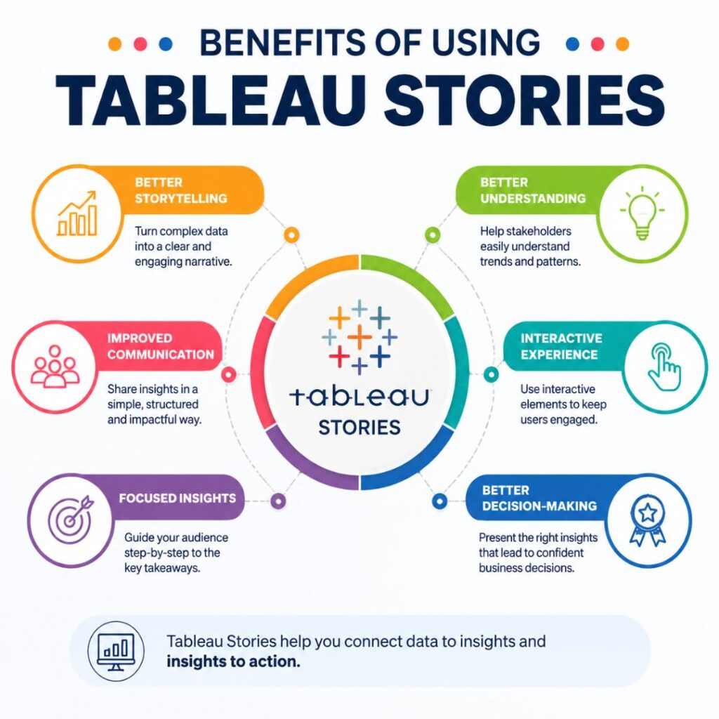
Creating Stories in Tableau helps organizations communicate complex data insights effectively. Some major benefits include:
- Better decision-making: Helps stakeholders understand important trends and patterns.
- Improved communication: Converts complex analysis into an easy-to-follow narrative.
- Interactive experience: Allows users to explore insights through visual elements.
- Clear business impact: Connects data findings with actionable decisions.
How to Create Stunning Tableau Stories
Regretfully, not every story is made equally. Simply glance at online book or movie reviews; not every narrative captures the hearts and minds of its target audience.
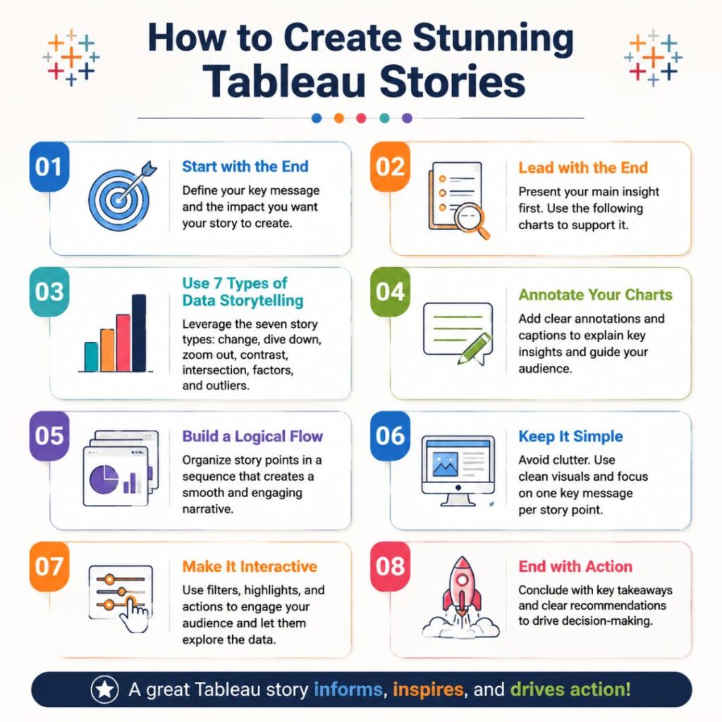
Remember to adhere to the best standards for visualisation and use the following guidelines to produce amazing Creating Stories in Tableau:
1. Start with the end.
Consider the design of your presentation. Think about the message you want to get through to the audience and how the tale will help you do it. In order to close the knowledge gap between the “how” of the analysis’s mechanics and the “why” of its importance, it is crucial to complete this visualisation process. Recall the effect you want the audience to feel from your presentation.
2. Literally “lead with the end”
Get right to the point; stakeholders don’t usually have the time or patience to sit through another presentation. In the first story point, your thesis should be briefly mentioned in one or two bullet points. The following charts provide evidence to bolster your thesis.
3. Apply the seven categories of data storytelling.
Ben Jones, co-founder and CEO of Data Literacy and former Technical Evangelism Director at Tableau, first presented this idea. It outlines seven data story types changes over time, dive down, zoom out, contrast, intersection, factors, and outliers—that you may use to craft a compelling data story. Every sort of story has a unique set of graphic templates. You can get ideas for charts to use in your next story by looking through this sample workbook.
4. Annotate your charts
The curse of knowledge should be avoided! You shouldn’t presume that the end users of your chart already possess all the background knowledge required to comprehend it. It’s possible that you analysed the data in an unconventional way to uncover significant trends and insights, but the graphic is probably new to your stakeholders.
After introducing Tableau stories, let’s go more specific!
Building Your First Tableau Story
Click the New Story icon to open a new story tab. Another option is to use the menu bar at the top to navigate to Story > New Story. Click in the left pane and drag the worksheet onto the blank canvas to add a dashboard or worksheet to your first story point.
After that, you can choose to add a new story point that is either a blank new story point or a duplicate of the story point you just generated. Charts, captions, and annotations will all be transferred to the new narrative point if you replicate your data point.
A caption describing the main idea of the story can also be added at the top. They are your story’s chapter headings, so keep them succinct (one or two phrases should do).
You can mark particular data points in your data story in addition to the captions. When attempting to explain trends or patterns that might not be immediately apparent to an outsider, annotations are very helpful.
Updating and Reformatting Objects
After you’ve included things in your story, you can edit and rework them to make them more witty and visually appealing. For example, you can choose to Hide Title from the menu by right-clicking on the narrative title. To reveal it, navigate to Story > Show Title.
If you want to keep the area more organised and choose not to add captions, you may also modify the story toolbar. Navigate to the Layout window on the left, select your preferred configuration.
Just click in the box to begin editing if you want to change the caption text. To edit annotations, double-click or select Edit from the menu on the right.
Currently, to change a chart, select it in the left pane and drag the new sheet over the existing story point and drop it. The story no longer includes the previous chart.
Go to the menu bar at the top and choose tale > Format to format your tale. The borders, alignment, colouring, and typefaces can all be changed.
It’s crucial to resize a narrative according to the platform you want to use to display it. The Desktop Browser, which has 1000 by 800 pixels, could be a suitable choice for desktop PCs or screens with greater resolutions.
Tableau offers three embed options: Web Page, Blog, and Small Blog. Click on Size in the lower left pane of your story, then choose a lower pixel count option from the selection for screens with lesser resolution.
If you choose not to use any Tableau narrative parts, you can also remove them. Annotations on charts can be removed by selecting Remove with a right-click.
To earn story points, click the X in the story toolbar at the top. Choose narrative > Clear from the menu at the top to remove every element from the Tableau narrative. You can click on the ⬅️ arrow to the right of the Tableau logo if you wish to go back in time.
Conclusion
Creating Stories in Tableau helps transform data into a meaningful visual narrative by combining worksheets, dashboards, and story points. It enables users to present insights clearly, highlight important trends, and support better decision-making. By following effective storytelling practices, Tableau users can create engaging and impactful data stories.
Creating Stories in Tableau is an excellent resource for delving deeply into a data challenge and inspiring action in your audience. Check out the Tableau online training to learn more.
FAQs About Creating Stories in Tableau
What is Creating Stories in Tableau?
Creating Stories in Tableau is the process of combining multiple visualizations, worksheets, and dashboards into a sequence of story points to communicate data insights effectively. It helps users present analysis in a logical flow rather than displaying data as separate charts.
How do you create a story in Tableau?
To create a story in Tableau, open a new Story tab, add worksheets or dashboards as story points, organize them in a meaningful sequence, and use captions and annotations to explain important insights.
What are story points in Tableau?
Story points are individual sections within a Tableau Story that contain worksheets or dashboards. Each story point represents a step in the data analysis journey and helps users follow the overall narrative.
What is the difference between a Tableau Story and a Tableau Dashboard?
A Tableau Dashboard combines multiple charts and visualizations into a single view, while a Tableau Story presents insights step by step using multiple story points. Dashboards are mainly used for monitoring data, whereas Stories are used for explaining analysis and findings.
Why should businesses use Tableau Stories?
Businesses use Tableau Stories to communicate complex information clearly, identify trends, explain performance changes, and support data-driven decision-making. Tableau Stories make it easier for stakeholders to understand the meaning behind the data.