Introduction
Imagine walking into a meeting with ten pages of spreadsheets. You know the data is valuable, but no one has time to read it. Now, imagine replacing those spreadsheets with one clear, compelling graph. The message is immediate. That’s the power of effective data visualization.
Data visualization helps people understand patterns, relationships, and trends in data quickly. When done right, it turns raw numbers into decisions. For those enrolled in Data analytics courses for beginners or pursuing a data analytics certificate online, mastering visualization is not optional it’s essential.
In this blog, we’ll break down the top principles of effective data visualization, supported by real-world examples, practical techniques, and hands-on advice to help you develop job-ready skills in the data analytics field.
What is Data Visualization?
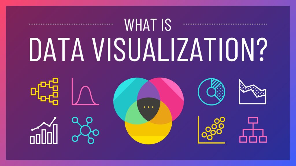
Data visualization is the graphical representation of data and information using charts, graphs, maps, dashboards, and other visual formats. The goal is to communicate complex data in a way that is easy to understand.
Common forms of data visualizations include:
- Bar charts
- Line graphs
- Pie charts
- Scatter plots
- Heatmaps
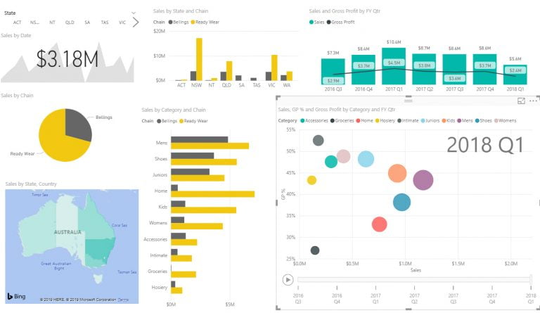
- Dashboards
Professionals in analytics use visualization not just to inform, but also to persuade. That’s why understanding effective data visualization is a cornerstone skill in any data analytics certificate online program.
Why Is Effective Data Visualization Important?
According to a 2023 report by Tableau, users process visual information 60,000 times faster than text. Effective visuals improve comprehension, reduce errors, and speed up decision-making.
Benefits Include:
- Faster insights: See trends and outliers at a glance.
- Improved storytelling: Turn data into a clear narrative.
- Better decision-making: Help stakeholders act quickly.
- Enhanced collaboration: Make data more accessible to non-technical teams.
In short, effective data visualization helps bridge the gap between data and action a skill that’s especially valuable for anyone starting with data analytics courses for beginners.
Principle 1: Know Your Audience
Your visualization must speak the language of your viewer. Ask yourself:
- Are they technical or non-technical?
- Do they need high-level summaries or granular data?
- What action do you want them to take?
Example:
A marketing executive may prefer a pie chart showing ad spend by channel, while a data analyst might want a detailed line graph of weekly ROI trends.
Tip: Always define your audience before designing your chart. Understanding your audience is taught early in most data analytics certificate online programs because it determines the entire direction of your visual story.
Principle 2: Choose the Right Chart Type
Different data requires different chart types. Selecting the wrong one can mislead or confuse viewers.
| Chart Type | Best For |
|---|---|
| Bar Chart | Comparing quantities |
| Line Graph | Showing trends over time |
| Pie Chart | Showing parts of a whole |
| Scatter Plot | Showing correlation between sets |
| Heatmap | Showing patterns in large data |
Example:
Use a line chart to display temperature changes over a year, not a pie chart. Choosing the wrong chart type is a common mistake beginners make but one that is easily corrected with the right training from data analytics courses for beginners.
Principle 3: Simplify Your Design
Too many colors, fonts, and effects can distract from the message. Less is more.

Keep It Simple:
- Use clean fonts like Arial or Roboto
- Stick to 2–3 colors
- Avoid 3D charts unless absolutely necessary
Tip: A cluttered visualization is worse than no visualization. Clarity always wins.
Principle 4: Use Color With Purpose
Color is a powerful tool when used intentionally. It should enhance understanding, not confuse it.
Guidelines:
- Use color to group or differentiate
- Avoid colors with poor contrast
- Stick to color-blind–friendly palettes
- Reserve bold colors to highlight important data
Example:
Use green for growth, red for loss. This simple color logic aligns with human instincts and makes the visual intuitive.
Principle 5: Ensure Accuracy and Honesty
Misleading visuals damage trust. Accuracy must be the foundation of all effective data visualizations.
Avoid:
- Truncated axes (e.g., not starting at zero)
- Distorted proportions
- Cherry-picking data points
Real-World Warning:
A finance firm once reported rising profits using a bar chart that exaggerated differences through a broken y-axis. The result? Lost investor trust when the real numbers came to light.
Principle 6: Highlight Key Insights
Don’t just show data—guide the viewer.
How to Highlight:
- Use labels or annotations
- Add arrows or callouts
- Apply conditional formatting (e.g., color changes)
Tip: Guide your audience to the conclusion you want them to draw. This technique is commonly taught in advanced modules of data analytics certificate online programs.
Principle 7: Use Context to Drive Meaning
Data without context is meaningless. Provide comparisons, benchmarks, or goals to make the visualization useful.
Example:
Saying “Sales were $50,000 in May” means little without context. Instead say, “Sales in May were 15% higher than April and 10% above target.”
Context transforms a chart from a picture into a story.
Tools and Technologies for Effective Data Visualization
In your journey through a data analytics course for beginners, you’ll work with several tools. Each tool has strengths suited for different levels of complexity.
Common Tools:
- Excel: Best for beginners and quick visualizations
- Tableau: Interactive dashboards and storytelling
- Power BI: Enterprise-grade visualizations for Microsoft environments
- Python (Matplotlib, Seaborn): Custom and advanced visualizations
- R (ggplot2): Rich, statistical visuals
Learning these tools is essential in most data analytics certificate online programs.
Real-World Applications of Effective Data Visualization
Here’s how businesses use visualization every day to drive action:
Marketing Analytics
Visual dashboards help teams track campaign performance, user engagement, and ROI.
Finance and Forecasting
Line graphs and heatmaps reveal spending patterns and future risks.
Healthcare
Hospital administrators use dashboards to monitor patient inflow, medication use, and recovery rates.
Supply Chain
Maps and bar charts identify shipment delays, inventory gaps, and cost overruns.
These examples are often used in data analytics courses for beginners to teach learners the real value of visualization.
Learning Visualization Through Data Analytics Courses
If you’re serious about mastering data visualization, structured learning helps.
What to Expect in a Course:
- Fundamentals of chart types and design
- Tool-specific lessons (Excel, Tableau, Python)
- Real datasets and industry case studies
- Mini-projects with peer reviews
Why Choose H2K Infosys?
- Hands-on labs with real business scenarios
- Industry-recognized instructors
- Certification aligned with job roles
- Ideal for both beginners and professionals
Whether you’re looking for a data analytics certificate online or exploring data analytics courses for beginners, visualization skills are a core part of every module.
Key Takeaways
- Effective data visualization helps people understand data faster and more clearly.
- It requires selecting the right chart, using purposeful design, and maintaining accuracy.
- Color, context, and audience awareness all play vital roles.
- Tools like Excel, Tableau, and Python make visualization accessible at all skill levels.
- Structured data analytics courses for beginners can accelerate your learning curve.
- Visualization isn’t just about looks it’s about insight, clarity, and impact.
Conclusion
Data tells a story but only when visualized effectively. Learn how to create charts that inspire, inform, and drive action.
Ready to bring your data to life? Enroll in H2K Infosys’ data analytics courses for beginners and earn your Data analytics certificate online. Get hands-on experience, build portfolio projects, and launch your career with confidence.
